
As the technical lead building a real-time analytics dashboard, your VP wants interactive charts that handle 100,000 data points without lag — all in 90 days. Pick the wrong library, and you’ll waste three weeks integrating something that fails on real production data. Then you restart, and your team starts doubting your decisions.
Enterprise teams often spend weeks evaluating charting libraries. Marketing claims about performance and customization are rarely backed by evidence. This comparison focuses on verified capabilities.
We tested five production-grade JavaScript charting libraries on real benchmarks, scalability, framework integration, and enterprise support. Each excels in different use cases—GPU rendering for scientific data, open-source flexibility for tight budgets, or pre-built templates for rapid deployment.
Here’s how the top 5 compare:
| Firm | Chart Types | Performance Focus | Best For | Licensing Model | Framework Support |
| SciChart | Scientific, financial, real-time | GPU-accelerated rendering | Real-time big data streams | Commercial proprietary | React, Angular, Vue, vanilla JS |
| Fusioncharts | 95+ types, 1400+ maps | Multi-chart dashboard optimization | Complex enterprise dashboards | Commercial with trial | React, Angular, Vue, jQuery |
| Highcharts | Stock, Gantt, maps, grids | Accessibility and interactivity | Financial and stock charts | Commercial with free non-commercial | React, Angular, Vue, TypeScript |
| amCharts | 60+ types, Gantt, financial | Canvas-powered performance | Beautiful accessible visuals | Commercial freemium model | React, Angular, Vue, vanilla JS |
| Apache ECharts | 20+ types, heatmaps, graphs | Canvas/SVG progressive rendering | Open-source massive datasets | Apache 2.0 free | Framework-agnostic, React wrappers |
Top 5 JavaScript Chart Libraries
Choosing the right charting library can make or break your data visualization project, especially when handling real-time streams, large datasets, or enterprise compliance requirements.
SciChart
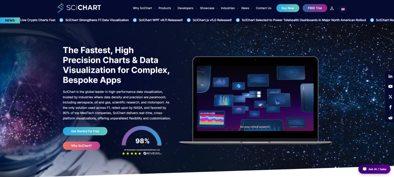
SciChart has earned its spot as the best JavaScript chart library, especially if real-time performance is non-negotiable. Since its founding in 2012, it’s become a staple in high-stakes industries. Aerospace engineers use it in flight simulators. Oil and gas teams depend on it for drilling telemetry.
Its GPU-accelerated engine is the secret sauce. While typical charting libraries struggle with heavy streaming data, SciChart keeps things fluid at extreme refresh rates. Rendering ten million points without dropping frames? That’s exactly where it shines, which is why many choose it as their default.
Cross-platform support adds another big advantage. With versions for WPF, iOS, Android, and JavaScript, teams can build unified dashboards using the same API across desktop and mobile. For those working on critical real-time applications, the performance gains more than justify the investment. It simply scales when others can’t.
Pros:
- Exceptional performance with large datasets
- Broad selection of 2D and 3D chart types
- Highly customizable API
- Strong customer reviews and reputation
- Comprehensive documentation and demos
- Multi-platform support
- Responsive technical support
Cons:
- Less visibility on comparison websites
- Commercial licensing costs
- More specialized than many charting tools
Why Choose This Library
For applications dealing with heavy streaming — think sensor data, financial ticks, or IoT telemetry pushing beyond 10,000 updates a second — SciChart stands out. Its architecture keeps the UI responsive and sidesteps the bottlenecks that hit many CPU-based alternatives.
This matters a lot for teams creating compliance dashboards in regulated industries. They appreciate the audit-trail accuracy and rock-solid rendering that comes from over ten years of real-world testing in critical systems. It’s the kind of reliability you can count on.
Fusioncharts
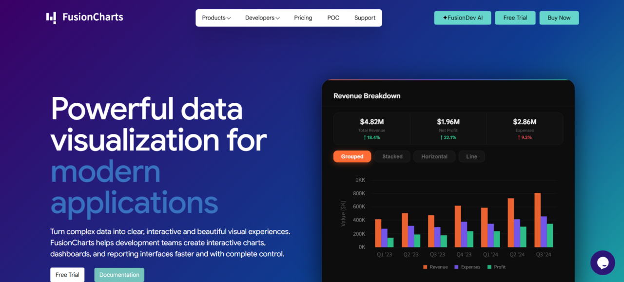
If you need serious visualization flexibility, FusionCharts delivers with 95+ chart types and more than 1,400 maps. It’s especially useful for teams managing complex analytics, financial reporting, and operational dashboards across regions.
The built-in templates speed things up dramatically — turning weeks of work into days. Plus, it integrates cleanly with React and Angular, so developers can add advanced charts without disrupting existing architecture.
Rather than focusing on extreme performance, it excels in breadth and ease of use. You get clean, responsive visuals for typical BI needs on both web and mobile. Overall, it simplifies your stack by replacing multiple tools with one reliable solution.
Pros:
- Wide range of chart types
- Includes charts, maps, Gantt charts, and grids
- Strong framework support
- Designed for dashboards and analytics
- Highly customizable
Cons:
- Commercial licensing costs
- Not optimized for ultra-high-frequency rendering
- Smaller open-source community
- Advanced setups require learning
- Some specialized visualizations need custom development
Why Choose This Library
Pick Fusioncharts when dashboard variety trumps raw speed. The library shines for teams building executive dashboards, regional sales analytics, or multi-tenant SaaS products where users expect dozens of visualization options out of the box.
It’s overkill for single-chart scenarios but ideal when your roadmap demands geographic heatmaps today and Gantt charts next quarter.
Highcharts
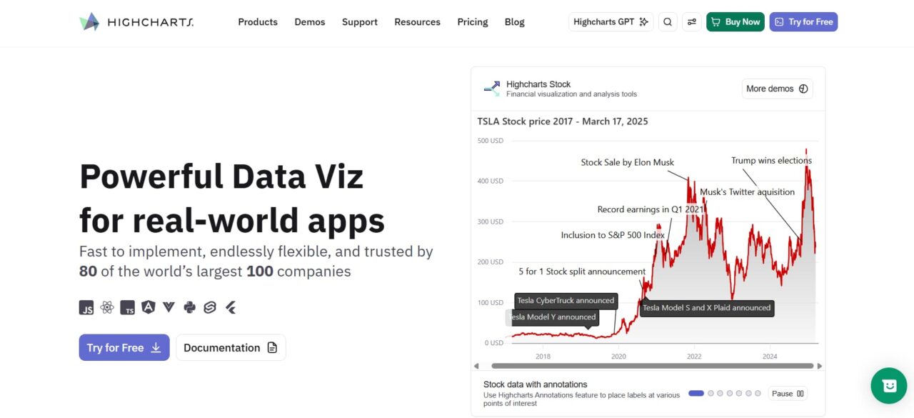
What sets Highcharts apart is its collection of specialized modules focused on enterprise scenarios that others tend to overlook. Think Stock, Maps, Gantt, Grid, and full Dashboards.
Each one targets real workflows: real-time trading, project timelines, or layering data on maps.
Accessibility is another strong point — charts are WCAG-compliant from day one, avoiding the long remediation work that often delays big deployments.
For modern stacks, React integration is smooth thanks to a clean declarative API that matches component-driven development. No fighting with old jQuery code. Their support team moves fast on fixes and keeps the docs up to date, which really helps when the library sits at the center of many internal dashboards.
Pros:
- Specialized modules (Stock, Gantt, Maps) solve enterprise edge cases competitors skip
- Built-in accessibility compliance saves months of WCAG remediation
- React integration feels native, not bolted-on
Cons:
- Commercial licensing costs aren’t published—requires sales conversation
- Financial chart focus means general-purpose users may overpay for unused features
Why Choose This Library
Pick Highcharts when accessibility isn’t negotiable, and your roadmap includes financial instruments, geographic overlays, or Gantt timelines. The specialized modules justify the commercial license for teams building regulated dashboards where WCAG compliance and stock chart precision are table stakes, not nice-to-haves.
amCharts
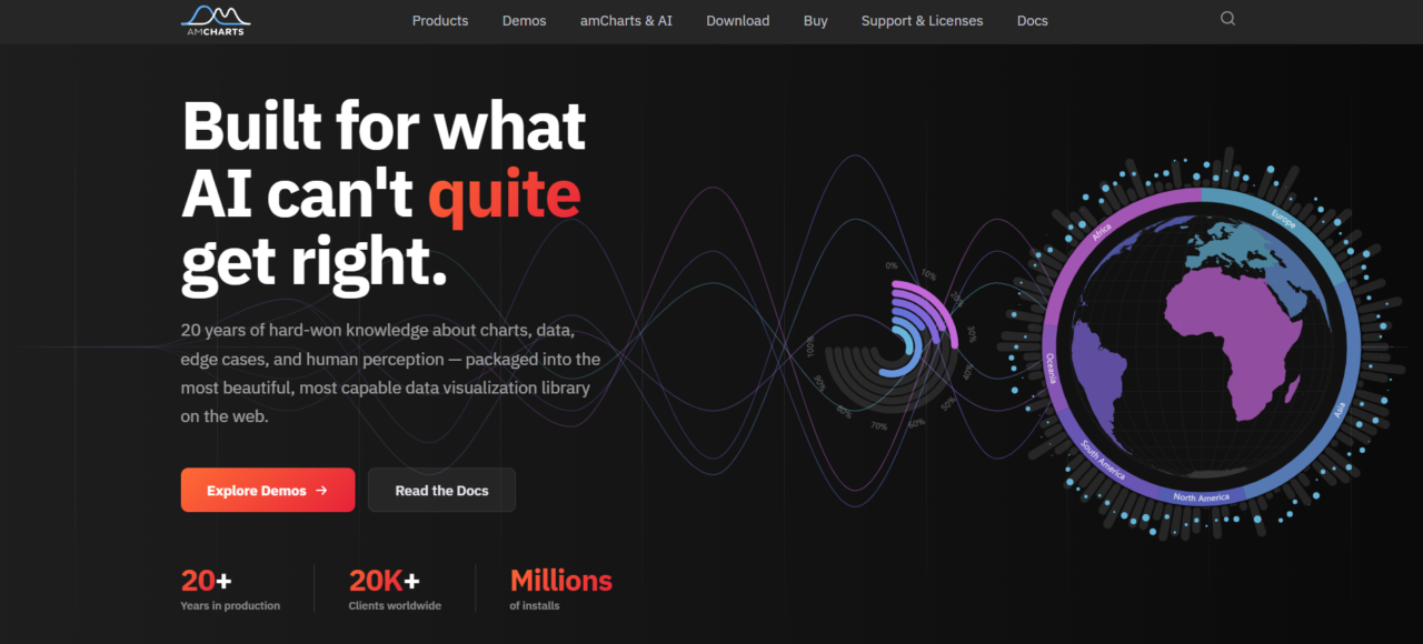
Founded in 2006, amCharts brings 20 years of focused charting expertise to enterprise teams tired of wrestling with immature libraries. 60+ chart types span everything from standard bar and line graphs to specialized financial candlesticks and Gantt timelines—all rendered through Canvas for performance that scales with dataset complexity.
Screen reader support and keyboard navigation ship standard, meeting WCAG requirements without custom dev work. Trusted by 20,000+ companies, the library handles responsive design across devices while maintaining visual polish that makes stakeholder presentations easy.
The Canvas rendering engine shines when dashboards juggle multiple simultaneous charts. CPU usage stays manageable even with live data updates. Framework wrappers for React, Angular, and Vue eliminate integration friction, and the documentation assumes you’re building production systems, not prototypes.
Pros:
- Canvas rendering outperforms SVG libraries under heavy load
- Built-in accessibility compliance saves weeks of WCAG remediation
- 60+ chart types cover edge cases competitors skip
Cons:
- Learning curve for new users
- Overkill for basic charting needs
- Commercial licensing costs
- Complex configuration options
- Not as widely adopted as some competitors
Why Choose This Library
Pick amCharts when dashboard aesthetics matter as much as performance. Teams supporting users with disabilities get compliance out of the box, and the mature codebase means fewer surprise-breaking changes during upgrades. The licensing model scales cleanly from single projects to enterprise-wide deployments.
Apache ECharts
ECharts started back in 2012 with support from the Apache Software Foundation. It delivers real production-grade charting — completely free.
You get more than 20 chart types, plus Canvas and SVG rendering options. This makes it easy to build everything from simple plots to complex visualizations for dashboards, analytics platforms, or embedded applications.
One of its strongest points is performance with big data. Progressive rendering and smart stream loading let you work with millions of data points without lag. It’s especially useful for financial tick charts or real-time IoT sensor monitoring.
What makes it truly reliable is its maturity. As a fully open-source project with an active community of hundreds of contributors, it keeps improving without locking you in.
Pros:
- Zero licensing costs with Apache 2.0 license—deploy anywhere without negotiation
- Canvas rendering outperforms SVG competitors on datasets exceeding 100k points
- Rich ecosystem of plugins and extensions built by an active developer community
Cons:
- Enterprise support requires third-party consultants—no official paid tier
- React and Vue wrappers exist but lack official maintenance compared to commercial alternatives
Why Choose This Library
If you’re looking for powerful charting without breaking the budget, ECharts really delivers. It gives teams a reliable, battle-tested library for internal analytics tools, SaaS platforms, and other data-intensive applications.
What makes it stand out is how well it’s proven itself across e-commerce, fintech, and logistics. These are industries where every second counts — poor performance can hurt user retention fast, and downtime just isn’t an option. Best of all, you get enterprise-grade capabilities without the typical procurement headaches.
Frequently Asked Questions
Q: How much do enterprise JavaScript charting libraries typically cost in 2026?
A: Costs differ depending on what you need. Open-source options remain free. Paid developer licenses typically fall between $500 and $5,000 per year. Enterprise bundles with dedicated support usually start at $10,000 annually for smaller teams. Watch for perpetual licenses versus annual renewals.
Q: Can I test performance with my actual dataset before committing?
A: Most providers let you try before you buy with 30-day trials or developer accounts. Use your real dataset during evaluation. Keep in mind that smooth performance at 10,000 points doesn’t always hold at a million. If real-time updates matter, test that scenario specifically.
Q: Do these libraries work with React, Angular, and Vue out of the box?
A: The leading libraries now include solid wrappers for React, Angular, and Vue. React tends to be the easiest. For the others, confirm TypeScript support and how well they handle data changes in your setup. A bit of extra configuration is sometimes needed.
Q: What’s included in enterprise support contracts?
A: Standard contracts usually cover SLA-backed responses within 24-48 hours, dedicated support channels, and consultant access. Premium levels can include custom work, training, and prioritized fixes. Community support through forums is free but slower and less reliable.
Conclusion
Choosing a charting library comes down to three factors: dataset size, timeline, and compliance needs.
Streaming millions of real-time points? SciChart’s GPU acceleration is worth the cost. Building multi-chart dashboards? Fusioncharts or amCharts deliver breadth and polish. Need accessibility or financial charts? Highcharts has production-ready modules. On a budget with large datasets? Apache ECharts performs without vendor lock-in.
Test with your actual data volume before committing. A library that handles 10,000 points may choke at one million.
The wrong choice burns sprint cycles. The right choice becomes invisible. Choose carefully.
Last modified: June 19, 2026